
Making Sense Of Subtotals Settings In The Power BI Matrix Visual
/For showing data, the Matrix visual is one of the most popular visuals, and most comfortable for Excel users since it looks a lot like a Pivot Table. Showing subtotals the way you want though can be a bit of a challenge simply because there are so many settings in the Formatting pane in different sections.
Lets quickly look at a few examples before doing a deep dive. This is how a default matrix looks with just a few fields. It has two rows (Year and Month Name), one column (Category), and one value (Total Sales).

Ideally, there would be one place to change all of the settings for a Matrix visual for the subtotals, but there isn’t. The settings are split among at least three sections in the formatting pane, and changing some settings in one area will automatically change other settings in other sections. So it can be a bit tedious to get it to look like you want. The good news is the Power BI Desktop editor gives you a lot of control. You just have to know where to look.
When you add a Matrix visual, it defaults to a stepped value, putting the subtotals next to the first row, or Year, in the example we’ll work through. (See the first image in this post.)
If you prefer the totals at the bottom, select the formatting pane for the visual, scroll down to the Subtotals section, and looks for “Row subtotal position” and change it to “bottom.”

This leaves a blank row though next to the Year row, and adds a new “Total” row description. It isn’t the most efficient use of space, but it makes more sense to many people to always have totals at the bottom.
If you don’t like the stepped format where the months are indented a bit, you can turn your matrix into more of a table format turning Stepped Layout off. Go to the Rows Headers section, and turn Stepped Layout off. Note that when you do this, it will automatically change the Subtotals/Row subtotal position setting to Bottom. You can change it back to top if desired.

Now the subtotals are at the bottom, but you no longer have the blank row by the Year field as it moves the Months Names to the next column. This is similar to switching a Pivot Table view in Excel to Table Format.
Let’s step back for a minute though and look at the major places in the formatting pane to change how subtotals can be displayed.
Row Header section
Stepped Layout - turn on or off. Think of this in Excel terms as as a table format (off) or classic Pivot Table format (on). Examples are shown above in the first two images.
+/- icons - turn on or off. Here you can turn the +/- expand/collapse icons on or off to allow your users to drill down at each row subtotal. This provides very granular control for your end user. See image 1 below to see how this looks.
As of the April 2019 build of Power BI, the +/- only affects rows. The Matrix visual cannot yet collapse/expand columns. Go to this UserVoice request to vote for this feature.
Values section
Show on rows - turn on or off. This only applies if you have two or more fields or measures in the Values section. See Image 2a and 2b below for an example of this. It changes how rows are displayed, which also impacts how subtotals are shown.
Subtotals section
Row subtotals - turn off or on. This will globally turn subtotals off or on for the entire matrix.
Row subtotal position - top or bottom. This will show the subtotals above (top) or beneath (bottom) the detailed data. The Row Header/Stepped Layout setting may change this setting automatically.
Per row level - this will allow you to turn off or on subtotals for each level. See image 3a and 3b below for examples.

Image 1 - +/- icons
In images 2a and 2b below, there are multiple values in the Values section. This example has both Total Sales and Total Units. If you just have two values, showing in columns might work but it is often better to switch them to rows as shown in 2b below. If you have three or more fields in the Values sections, showing on rows is usually the better way to go.

Image 2a - multiple values in columns

Image 2b - multiple values in rows - Values/Show On Rows turned on
If you want some subtotals, but not at every level, change the setting in the Subtotals section, Per row level settings. If Per row level is set to off, you’ll have subtotals on or off for every row you have data in. So in this example, it means subtotals at the Year, Month, and Group level.
Image 3a - Subtotals are on, Per row level is off. This means for every field you have in the Rows section, you’ll have a subtotal
Image 3b - Per row level is on, and I’ve turned off the “Group” level, so there are subtotals for Year and Month.
Image 3c - Per row level is on, and I’ve turned all subtotals off except the “Group” level.

Image 3a - Subtotals at every level

Image 3b - Subtotals off for Group
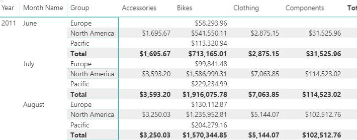
Image 3c - Subotals on for Group, off for Year and Month
The Matrix visual is very flexible. It is likely possible to get it to show the subtotals you want, but you have to play with several different sections in the Formatting panel and understand how they interact with each other.
PS. There is another UserVoice request to show more that just the word “Total” when there is just one field in the Values section. Go here to read more about it and vote for it.