
Use Data Profiling in Power Query
/I often give demos or training in how to use Power BI, and when I am in Power Query, my screen usually looks something like this:
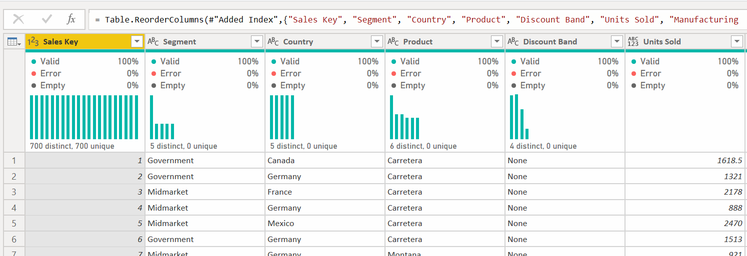
One of the first questions I get asked is “How did you get those bars and graphs across the top?” Those are called data profiling tools and they can be incredibly helpful when you are cleaning your data. Let’s take a look.
By default, you usually just have the thin bar shown below that gives you a little info on your data.

A solid green bar is usually best. It means there are no issues in that column, as shown in the Discounts field. On the far right in the COGS field, there is a tiny bit of gray. That means there is no data, or a null, in one or more records. The bigger the gray bar, the higher percentage of nulls there are. In the middle though we have a problem. Anything in red is an error and must be fixed. These may cause more errors in further transformations downstream, and will usually cause refresh errors.
Before we address this, let’s get a bit more information about our data. Go to the View ribbon, and there are 3 settings we want to look at.

Column Quality - this will give us some additional statistics about the column
Column Distribution - this will give us the bar graph with info on how many distinct and unique values there are
Column Profile - this will open up a large pane that will have a ton of stats about the column, like the min and max values, average value, value distribution, and more.
Let’s look at them one at a time. I’m going to go ahead and check both Column Quality and Column Distribution for now.
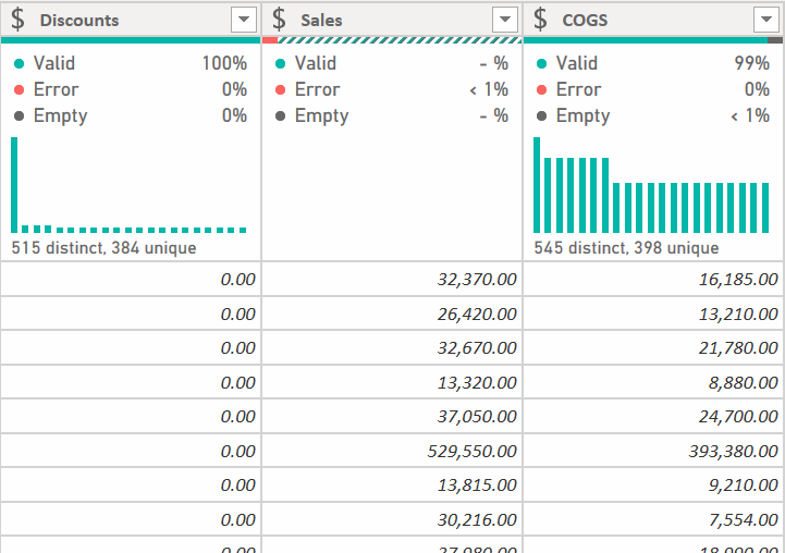
For the Discounts column we can see now that the data is 100% valid, meaning no errors, and no empty or null records. There are 515 distinct values, 384 of which are unique. If you are working with a field that will be the 1 side of a 1 to many relationship in the DAX model, you want to make sure your data profile looks like this:

You want the distinct and unique values to be the same, and there can be no empty values. This is a small dataset with only 700 records. When you are working with more data, it is likely it will tell you you have 1,000 distinct and unique values. Data profiling by default only works with the first 1,000 records to avoid a performance hit. More on that later.
For the Sales column with an error, you’ll need to figure out what the error is and fix it. The fastest way to do this is to hover over the thin bar with the red in it and you’ll get this popup:

Click on the ellipses menu and you can take action:

Unless I already know what the issue is, I will almost always select “Keep Errors” and investigate to see if I can safely delete that record. Then I’ll decide if “Remove Errors” is appropriate, or see if I need to fix an issue with the source data. Note that Remove Errors will remove the entire row. You might want to use the “Replace Errors” feature and replace with null or 0. To see exactly what the error is, click to the right of the word “Error” - not on the word itself - in the cell and Power Query will bring up a window at the bottom of your screen that will show you what the error is for that specific cell.

In this case, there was some text in the Sales field. So whether I replace it with 0 or null, remove the row entirely, or fix the source data, it has to be fixed.
As for the tiny gray bar for the COGS column, that means there are some empty, or null, values. Those may or may not be ok in your data. Some fields like “Date Completed” may have a lot of nulls where items aren’t finished, but things like Sales or COGS would seem to indicate an error of some sort if there were missing data there, perhaps indicating someone hadn’t set up the standard cost or sales price in the source system correctly. You have to determine how to proceed here. Power Query is just helping to bring the issue up.
The final checkbox in the View ribbon is the Column Profile. I generally leave this off and turn it on when I need it. Here is it is on, and I’ve selected the Sales column

This gives a tremendous amount of information, but it also takes up half of the screen. This is why I turn it on and off as needed. You can see there are 700 records, 6 of which are distinct. There are no unique values, and the prices are distributed as shown in the graph to the right.
Remember though that no matter how large your data source is, this will only profile the first 1,000 records. If you want to see the stats for your entire dataset, you can. In the lower left corner of your screen, there is a small text box that says “Column profiling based on top 1000 rows.” Click it and you’ll see this:

You can change it to look at your entire dataset, but be forewarned, this can be a severe performance hit. If your data has a few million records, every time you make a change to your data, Power Query will rescan the entire dataset and generate the data profile statistics. That can take several minutes with each click. For me, it is slow enough that I would just rather load what I have into the data model and use DAX to return the stats I need.
One more thing. Take a look at this column:
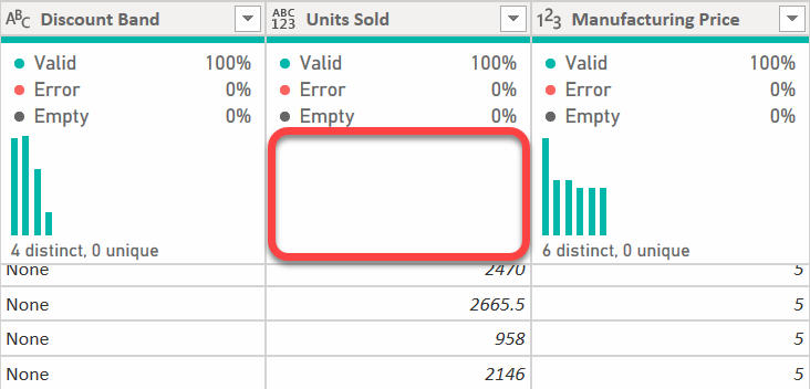
You’ll notice there are no bars analyzing the data. This is because there is no data type for Power Query to work with. The data type is set to Any, or ABC/123. You should never let an Any data type column make it to the DAX model and this is a good indicator that you have a column data type not properly set.
Hopefully that helps. Every time I get a fresh install of Power BI or Excel, I always go to the View ribbon and make sure that Column Quality and Column Distribution are on. And while you are there, go ahead and make sure “Formula Bar” is checked as well. I believe fresh installations in early 2021 and later have this on by default, but if you installed your version of Power BI or Excel before that, the Formula Bar will be off, and it will not get turned on automatically by monthly updates.