Tips for Debugging your DAX Code

When trying to get your DAX measures to work correctly, there are a number of tools you can use to debug, which I will briefly mention, but not go into depth on. Instead, this post is about how to think about debugging your code. I am focusing on DAX here, but many of the methods would apply to any type of code.

First, the tools you can use. This is not a comprehensive list, just something to get you started.

  1. Use Variables. Variables have several benefits:

    1. Variables are processed one time and can be reused later in the measure in multiple places. This can speed up your code.

    2. You can return a variable result to the visual itself. This allows you to see what each component is doing to ensure each part is calculating correctly.

  2. CONCATENATEX - If a variable returns a table, you cannot return that variable directly to the visual. A measure requires a scalar (single) value. CONCATENATEX will convert a table to a scalar value so you can see everything in that table. You can also use the newer TOCSV or TOJSON functions, which do similar work different ways. TOCSV and TOJSON are the underlying functions that help EVALUATEANDLOG return results, and aren’t really meant to be used in a production model, but they are handy in debugging.

  3. EVALUATEANDLOG - This is a relatively new function that will generate a ton of output for each expression you wrap with this function. There is a massive 4 part series on EVALUATEANDLOG here, including links to download the free DAXDebugOutput tool that will be necessary to read what this function returns. Note: Be sure to remove EVALUATEANDLOG once you are done. It will slow your code down. You should never publish a report that has this function in it.

  4. Tabular Editor 3’s Debugger - This is simply the luxury vehicle for debugging DAX. More about this tool is here.

Instead of an in-depth look at these tools though, I want to look at the thought process when debugging and offer some tips.

First, when debugging DAX, be sure to do it in a Table or Matrix visual. You need to be able to see what numbers are being returned for each value in the columns and rows. This is impossible to do efficiently in a bar or line chart. To quickly convert your visual to a table or matrix, make a copy of it in Power BI, then while it is selected, select the Table or Matrix visual icon in the Visualization Pane. You might need to move fields around to get the correct fields in the Rows, Columns, and Values section.

Next, make a note of any filters you have set in the Filter Pane, then clear or remove them. You need to understand what the core calculation your measure is doing before any filters are applied. This may not be the result you want, but you have to start with the unfiltered result. For example, you might only be interested in getting an average 12 months of sales for Texas, but if the [Average 12 Months of Sales] measure is wrong at the global level, having your report filtered for United States is only muddying the issue. Make sure that figure is correct globally first. Then you can apply filters. If you apply the United States filter and Texas is still wrong, it is possible your measure is fine, but you have a problem in the data. Zip codes are assigned to the wrong state for example. But you will never figure that out if you have no confidence the measure itself is correct. When debugging DAX measures and queries, we take for granted that our data is good. That isn’t always the case, so keep that in mind.

We’ve all built reports where we create 3-4 measures, then create several measures with new logic and include those original measures. and before you know it, you have 40 measures with a complex web of dependencies. And the measure you are debugging references 8 of those measures.

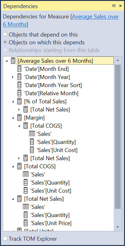
dependency view from Tabular Editor

As you can see above, a single measure can have many, perhaps dozens, of fields and measures it is dependent upon. When this happens, I generally tear down the measure to the component parts, even replicating code from other measures into the one I am debugging. Often I find some code in one of those dependencies that works great for that particular measure in a specific chart, but it doesn’t work well when used inside of your measure. Context Transition can be invoked at the wrong granularity (subtotal or total level) and return undesirable results, or it has a particular filter applied or removed using CALCULATE. Start simple, and rebuild it. Once you get it working, you can replace the duplicated code with the measure it came from. Sometimes though you might find your new code runs much faster. Iterators like SUMX and AVERAGEX often benefit from streamlined code vs using measures. As already noted, using measures in iterators can produce undesirable results at the total level. Look at these two examples:

Average Sales per KG = AVERAGEX(Sales, Sales[Units] * Sales[Price] / RELATED(Products[KG]))

Average Sales per KG = AVERAGEX(Sales, [Total Sales] / [Total KG])

If you put both of those measures in a table and it is by invoice number, they will both produce the correct results at the detail level. However, the second example that uses measures will not produce correct results at any sub-total or grand total level. It will total the sales for the entire table then divide that by the total of the kilograms. A useless result. (Ignore I am using the / symbol vs DIVIDE(). I am going for clarity here, not best practice.)

So here, reusing measures actually cause a problem. That is not often the case. I am a huge fan of reusing measures, but it isn’t always the answer, and can make debugging more challenging. Never assume your dependent measures are correct, or at least correct for your current needs.

Next, take a step back and try to understand the question being asked. Have the question phrased in plain business language. For example, here are two ways you can be presented with a question from a user for the report:

  1. I need to get the total sales where the Relative Date is 0 through -7.

  2. I need to get the total sales from today going back 6 days.

Those are not even the same question, and there are several ways to interpret #2.

  1. You’ll notice in #1 that is a range of 8 days. So if you are getting that type of request from a user or co-worker, you might not think to push back, Instead you may give them a simple measure with a filter predicate like ‘Date’[Relative Date] <=0 && ‘Date’[Relative Date] >= -8. That filter is correct, but it likely answering the question in the wrong way.

  2. When the person says “today going back 6 days” what does “today” mean? Today’s calendar date, or the latest date in the model, which might be a few days ago. Using TODAY() in a measure and then walking back 6 days will give the most recent 7 days, but the last 2-3 days might have no values if there are weekends or holidays involved. That might be correct. It might not be.

The point is, understand in plain English what your user is needing in the visual. Then you can start to craft the code to return that value. But if they start talking all DAXy to you, you might be debugging the wrong logic.

Do it in Excel first. Or have the user do it in Excel. Sometimes pointing directly to cells will allow you to understand the logic. You can rarely convert Excel formulas to DAX, but once you understand the logic of what is happening, writing the DAX becomes much easier. And you will also have the benefit of the correct answer in Excel you are trying to match.

You can also write it out on paper, or better yet, if you are on site, use the biggest whiteboard you can find and draw the logic out there.

Sometimes you just need to a break. Go for a walk. I have solved tons of problems a few miles from home on my morning walks. Staring at the same code can reenforce that bad code in your head and you cannot see a way around it. Stepping away removes that barrier.

Ask for help. I cannot stress this enough. Innumerable times I’ve asked for help and in just talking through the problem, I find a new path myself without the other person haven spoken a word. Some people call this “talking to the rubber duck.” Put a rubber duck on your desk and when you get stuck, tell the duck what the issue is. Just talking out loud you have to go much slower than thinking through it, and that alone helps.

Of course, asking someone can reveal the answer or a path forward. Ask a co-worker. Many organizations have Power BI or data analytics groups in Teams, Yammer, Slack, or other collaboration tool. Don’t be afraid to jump in with the question or ask for a meeting where you can do a screen share. I have helped others that had super basic questions a new person to Power BI would ask, and I’ve been on 2-3 hour screen shares where I and a co-worker untangled a gnarly problem. Sometimes it was my problem, sometimes theirs.

There are also the public forums, like the Power BI Community. It is especially important in those communities to give adequate sample data in a usable format - CSV or XLSX, and a mock up of the desired results. Don’t take shortcuts with your question. The people you are talking to know nothing about your scenario, so where you can take shortcuts with your co-workers that know the data and the company, forum members don’t. So carefully explain the issue.

One of the latest fads is to ask ChatGPT. That is ok as long as you don’t trust the code for the correct answer. I’ve found ChatGPT doesn’t always return code that even works, let alone code that returns an accurate result. However, it can help directionally, and suggest functions, or different ways to shape and filter the data you might not have thought of.

Regardless of where you might get an answer, verify it is correct. It may return a number, but verify it is the correct number.

Hopefully the above tips will help you rethink how you approach a problem you are stuck on. Of course, learn the debugging tools and techniques mentioned above. The best time to learn those tools is when you don’t need them. Have a complex measure that already works? Awesome. Throw a table visual with that measure into Tabular Editor 3 and see how the debugger works, or wrap some of the variables in EVALUATEANDLOG and see what the DAXDebugOutput tool generates. Then when you do have a problem the output from these tools will be familiar to you.

Why You Should Avoid Calculated Columns in Power BI

First off I want to make sure it is clear that I am not saying “never use calculated columns.” I am not. What I am saying is they should be avoided, and there are several reasons. I am going to focus on the model size, and thus performance. Note that the data I am going to show is a contrived set of data for demonstration purposes only to explain.

Power BI, which includes Power Pivot models and SSAS Tabular models, compresses the data in tables as it is loaded to the service. It never uncompresses that data. All calculations are done on the compressed data. If you want to know how this works, I suggest you read Chapter 17 in The Definitive Guide to DAX, Second Edition. It does a thorough job of explaining how the VertiPaq engine works.

Here is the scenario. I have a 200M record table with three columns:

  1. A list of numbers from 0 to 100,000,000 in 0.5 increments. This has 200M unique values.

  2. A list of numbers that rounds those numbers to whole numbers. It has 100M unique numbers. 0.5 and 1.0 from the first column are 1 in the second, 1.5 and 2.0 are 2 in the second, etc.

  3. A third column is a text value of “Even” or “Odd” that is based on the second column. This field only has 2 values.

The column to pay attention to is the [Even or Odd] column. I created this column two different ways. First in Power Query and then as a Calculated Column in DAX. This is important to understand.

All data in the model is compressed, but only data that is imported is taken into account when creating the optimal sorting algorithm to determine the best possible compression. So when I loaded the table with [Even or Odd] as an imported column, the VertiPaq engine considered that column when compressing the data. When it created it as a Calculated Column, it was compressed, but only by taking the [Index] and [Integer] columns into account for the best possible compression. Compression optimization happens at import and load. It does not get re-optimized and re-compressed when you add new columns.

Using the VertiPaq Analyzer from DAX Studio, we can see how much data each of these columns consumes.

Focus on the Total Size column. There are only 2 values in the [Even or Odd] column - “Even” or “Odd.” Note: The scenario gets a bit more complex here as these text values create a dictionary, which is a further optimization I am not going to get into here because the effect is the same on both tables - again, see the Definitive Guide to DAX for more on this.

On the bottom table, called “Imported”, the [Even or Odd] column consumes roughly 18KB. Remember, there are 200M records here. However, the VertiPaq engine looked at this column and realized it had a low cardinality, only 2, and sorted by that column first. This means theoritically it could represent this by just two values - “Even” for the first 100M records, and “Odd” for the second 100M records, and that is, in effect, what it did. At 18KB that is certainly more than 2 text values, but again, this gets deeper in to how VeritiPaq splits the data, and this 200M record table is broken up into 191 segments in Power BI. Again, read the book.

Now look at the top table - Calculated Column. In this table, the Vertipaq engine only looked at the [Index] and [Integer] columns when optimizing for compression, and there isn’t a lot of compression going on here. The [Index] isn’t compressed at all. There are 200M unique values. The [Integer] column can be compressed, but not by much, as there are still 100M unique values, which is why it is not quite half the size of the [Index] column - roughly 0.86GB vs 1.49GB.

But the [Even or Odd] column had to resign itself to be compressed at whatever compression algorithm was used by VertiPaq for the imported columns. As a result, even with 2 values, it is almost 25MB in size, or 1,338 times larger than the imported version!

What does that mean in practical terms? As one example, if you do any calculations based on the [Even or Odd] column, the computer hosting the model has to use 25MB to hold the Calculated Column version vs 18KB for the imported version. The speed of calculations will be faster on the smaller set of data. Again, this specific example is contrived, so the speed of calculations for 18kb vs 25MB will not be very large, or perhaps even noticeable.

Note too that when processing a model, the entire model is loaded in RAM. This is very different to how relational databases like SQL Server or Oracle work. They only load what they need from disk to do the necessary calculations. VertiPaq doesn’t work that way. It loads it all.

Now consider what happens if you add 10 more columns to each of these tables. Doing it using DAX will greatly increase the size of the table vs doing it in Power Query or in your data source.

And that is the point. Calculated Columns will increase the model size, which in turn increases the amount of RAM needed to hold the model, and the time it takes to run calculations on it.

There are other reasons to transform your data in Power Query or further upstream. In this example, I could have removed the “Integer” column from the table before loading keeping only two columns. You cannot do that with DAX. You can add to the model, you cannot take away without destroying data and any Calculated Columns that depend on it. This is why I avoid at all costs any LEFT/RIGHT/MID logic in a Calculated Column. I get what I need in Power Query, then remove the source column. Saves space, refreshes are faster, and calculations are faster.

So when should you use a Calculated Column? Here are the questions I ask myself:

  1. Am I transforming data or adding data based on other columns? Do this in Power Query or earlier. This is often possible. Exceptions are when the DAX is looking at multiple groupings of data via a SUMMARIZE() or data in other tables. Power Query is inefficient here, but it may still be possible in an earlier source like SQL Server. This is especially important if you don’t need the original data you are transforming. You can delete unnecessary columns in Power Query when loading data. You cannot delete columns in the model without breaking Calculated Columns that rely on that data.

  2. Does this need to be in a slicer or filter? This has to be a column - it cannot be a measure. But if it can be done in PQ or earlier, do it there.

  3. Is the formula really complex and won’t work in a measure? This usually isn’t a good reason. I’ve yet to see a DAX formula in a Calculated Column that could not be reworked to be a measure. Calculated Columns have row context and not filter context. Measures are the opposite. They have filter context and not row context. This is where it becomes necessary to really understand evaluation context, how to create row context in a measure using iterators, and when to invoke context transition via CALCULATE. It can be done, it just requires some work. Reach out for help in the Power BI community or talk to co-workers.

  4. If the formula in a measure is inefficient, then a Calculated Column helper column may be necessary. I had a particularly gnarly measure that used PERCENTILE.INC() three times over three groupings of data with SUMMARIZE(). The measure worked, but was horribly slow. PERCENTILE.INC() required the formula engine, and that was simply inefficient over 20M records as users filtered data. It was also impractical to attempt to do this in Power Query or the source systems, some of which were just CSV files. So I let a Calculated Column do the heavy lifting by moving all of the PERCENTILE.INC logic there, reducing the visual rendering from over 8,000ms to under 500ms when done. But it was a last resort, not the first thing I reached for.

  5. Am I just developing right now? I use Calculated Columns every day during development. Super easy to analyze data and start the logic of the DAX code. But I make it a point to convert to imported columns to measures and remove the Calculated Columns from the code before I even push a model to the Test environment.

Remember, Calculated Columns aren’t inherently bad. They are there for a reason. But they aren’t meant to be used like you’d use a column in Excel. Most of the time, I find they are not needed and have adverse impacts on the model, but there are definitely use cases for them and some of my models have them for very particular reasons. The key as a good Power BI developer is knowing when to use them and when to avoid them.

Working With Sparklines In Power BI - All About The Filter Context

With the December 2021 version of Power BI Desktop, as well as authoring reports in the Power BI Service, we can now add Sparklines to our Table and Matrix visuals. With just a few clicks you can make visuals that look like this:

This isn’t a tutorial on how to create sparklines as Microsoft has you covered there. What I want to discuss though is how Sparklines are impacted by the filter context in a visual. First though you need to enable this feature. It is in preview mode at launch, so go to File, Options, Options and Settings, and look for the Preview section. Click Sparklines, then close and restart Power BI Desktop.

In the visual above, I added the “Month” field to the Sparkline settings and that created an additional filter on the visual. Before I added the Sparkline, Year was the only filter affecting the numbers. By adding the month to the sparkline, shown below, it breaks out the Total Net Sales figure by month.

But what if I don’t want the sparkline to be the full range of data. For example, I just want the sparkline to show the last 3 months of the year, so 3 data points, not 12. As a measure, this is simple.

Sales Last 3 Months =
CALCULATE(
    [Total Net Sales],
    'Date'[Month] IN { 101112 }
)

As you can see, this returns the correct value as a value in the matrix, but the sparkline created for it using months is flat. Each of the data points are the same, and there are 12 of them, not 3. What is going on?.

This is context transition. When you alter a measure within Calculate, it does several things. This article isn’t a deep dive into context transition, but the key issue here is when I told it in the measure above to only show me when the ‘Date’[Month] column is within the values between 10 and 12, it replaced the existing filters coming from the Date table, which for months would be the values 1-12. You can see that here if I add the Month field to the table.

When only the Year is showing in the visual, you don’t see this. But the adding the Months field makes it clear what the model is doing. When I added the Month field to the sparkline setting, the exact same thing happened. Now, if you are pretty good at DAX, you’ve already figured out how to fix this. What we need to do is restore the filters on the Sales Last 3 Months measure so the total remains $2.7M, but the individual monthly amounts for October - December are retained. There are several ways to do this. First I’ll do it by restoring the values for month within the measure, and the VALUES() function is perfect for this.

Sales Last 3 Months =
CALCULATE(
    [Total Net Sales],
    'Date'[Month] IN { 101112 },
    VALUES( 'Date'[Month] )
)

Now for each row in the matrix, it looks at the month. For January, there is a 1. VALUES(‘Date’[Month]) returns 1, but the predicate ‘Date’[Month] IN {10, 11, 12}) is returning only 10 - 12. Remember that filters in DAX are tables, so it is a mini-table of 10, 11, and 12. And multiple filters in CALCULATE are combined using AND logic. So the table of 10, 11, 12, AND the table of 1, from the VALUES(‘Date’[Month]) function, returns nothing, because they don’t intersect at all.

This process repeats, and gives us blanks for months 1-9. But in October, VALUES(‘Date’[Month]) returns 10. That with AND logic for 10, 11, and 12 returns 10. So now it will show October sales. The same for months 11 and 12. We get this:

Now we have the correct value for months 10-12, and nothing for months 1-9. The total is still $2.7M, so it is working. Let’s remove the Months field from the visual and take a look at the sparklines now.

Bingo. That is exactly what we were looking for. Using VALUES is the easiest way for me to visualize what is going on in the model, but there is a better way, There is another function in DAX called KEEPFILTERS that is most often used within CALCULATE. Change the measure to this:

Sales Last 3 Months =
CALCULATE(
    [Total Net Sales],
    KEEPFILTERS( 'Date'[Month] IN { 101112 } )
)

KEEPFILTERS() will keep CALCULATE() from overwriting the filter for the ‘Date’[Month] column, and, well, keep the filters from that column, which is being supplied by the sparkline settings.

Sparklines has been a long requested feature, and I’m glad to see it has finally arrived. If you see unexpected results though, you have to step back and think about the filter that the sparkline added, and see if you have a CALCULATE in that field impacting how the filters work. KEEPFILTERS() is likely the way to fix it.

Calculate Last Twelve Months Using DAX

One of the more common calculations a company uses is the last twelve months, or LTM, of data. This can be tricky if your date table always has a full year of dates for the current year, which it generally should. So if today is March 3, 2019, my date table will have dates through December 31, 2019. This is usually necessary for the date intelligence functions in DAX to work properly, and companies may have data beyond today in their model. For example, budget and forecast data will generally extend through the end of the year, or at least beyond today.

However, it often is challenging when you are trying to hide these future dates for specific measures. I’ve seen solutions that use functions like LASTNONBLANK() that get the last date with sales data in it, and that can work, but depending on how your data is laid out, it can make for larger and more complex measures with multiple FILTER() functions. For a visual you can sometimes use the relative filtering feature, but that won’t change the underlying value of the measure if you reuse it in another visual or refer to it from another measure.

Marco Russo recently wrote an excellent post on hiding future dates or calculations in DAX. The concept is brilliantly simple. Just add a column to your date table that returns TRUE if the date is today or earlier, or FALSE if it is after today, then use the CALCULATETABLE() function to return just a table of dates that fall in that TRUE range of dates.

That wouldn’t work for me though exactly as it was presented. I needed to create dates that were in the previous 12 calendar months, and I was working with a Power BI Dataset, which is a Live Query, and you cannot add columns to Live Query models.

20190303 - No New Column SSAS.png


So I opted to create two measures. First, I needed to create the date logic in my dates table. I wanted the previous 12 full calendar months, not the last 365 days of data. Note that my date table is named ‘Calendar’.

LTM Dates = 
VAR EndDate =
    EOMONTH ( TODAY (), -1 )
VAR StartDate =
    EDATE ( EOMONTH ( TODAY (), -1 ), -12 ) + 1
RETURN
    IF (
        MAX ( 'Calendar'[Date] ) >= StartDate
            && MAX ( 'Calendar'[Date] ) <= EndDate,
        TRUE (),
        FALSE ()
    )

This measure has two variables:

  1. EndDate - This calculates the last day of the month for the previous month based on TODAY().

  2. StartDate - This calculates the month 12 months prior to the EndDate, then adds one day to move to the first day of the next month.

Finally the measure uses a basic IF() statement, with some AND logic. If today is March 3, 2019, it will return TRUE for the dates March 1, 2018 through February 28, 2019. For dates before March 1, 2018, and after February 28, 2019, it returns FALSE. It will do the for the entire month of March. On April 1, the LTM range becomes April 2018 - March 2019.

I could have used the AND() function instead of the double ampersand, but I use the double ampersand as I can use multiple conditions, like condition1 && condition2 && condition3, whereas AND() is limited to two conditions. By getting in the habit of using &&, I never have to remove an AND() function and redo the syntax. Side note: Use double pipes to allow multiple conditions for OR logic. Condition1 || condition2 || condition3, as OR() is also restricted to two conditions.

Now I needed to calculate sales for LTM. I already had the [Total Sales] measure below:

Total Sales = 
CALCULATE(
    SUM(Sales[Sales]),
    Sales[Type]="ACT"
) 

The measure for [Sales LTM] then is:

Sales LTM = 
CALCULATE(
    [Total Sales],
    CALCULATETABLE(
        'Calendar',
        FILTER(
            'Calendar',
            [LTM Dates] = TRUE()
        )
    )
)

You could combine my first measure with the second measure, replacing [LTM Dates] with the full measure, after tweaking the date logic in the FILTER() section a bit in this [Sales LTM2] measure.

Sales LTM2 =
VAR EndDate =
    EOMONTH ( TODAY (), -1 )
VAR StartDate =
    EDATE ( EOMONTH ( TODAY (), -1 ), -12 ) + 1
RETURN
    CALCULATE (
        [Total Sales],
        CALCULATETABLE (
            'Calendar',
            FILTER (
                'Calendar',
                'Calendar'[Date] >= StartDate
                    && 'Calendar'[Date] <= EndDate
            )
        )
    )

However, this measure is both a bit more complex, and if you wanted to have other LTM measures, such as units sold, or cost of goods over the last year, dollars purchased, etc., you’d have to repeat the date logic in each measure. If you wanted to change the LTM logic, say switch from previous 12 completed calendar months to last 365 days, or last 12 calendar months but starting with this month, you’d have to edit every measure calculating the date range. By breaking it into two parts as I’ve done above, I can edit just the [LTM Dates] measure and all other measures that use it will automatically recalculate accordingly.

Also note that unlike Marco’s solution, my date measure will not behave as a calculated column.

  1. You could not use it in an iterator function such as SUMX(), AVERAGEX(), and so on, as iterators use row context, and measures generally do not have row context. Well, iterator measures do, but they have to have row context to start with. They cannot create it out of thin air.

  2. You also cannot use measures in slicers or filters in your report. For those, you must use either a calculated column, or bring the column in through Power Query.

  3. You cannot use it as the date column in a date intelligence function, because it isn’t a column.

Calculated columns, and better yet imported columns via Power Query, can be a better choice for the above secenario, but that is not always an option if your source data is from SSAS or a Power BI Dataset where adding columns isn’t permitted.