Enhancing Power BI Apps with Emoji

Your report page names, and in turn, the Power BI app can be enhanced with the judicious use of emoji. I was surprised to find out that the characters came through in full color, and that can help your users find the important pages faster. This can be especially useful in a large Power BI app with dozens of reports and potentially hundreds of pages.

Adding emoji is relatively straight-forward in Windows 10 and 11. Below are the steps for Windows 11.

  1. Double-click on the report page name in Power BI Desktop and position your cursor at the end (or beginning if you prefer).

  2. Press and hold the Windows key, đŸȘŸ then the period key and the emoji picker comes up.

  3. In the search box, type the name or a description of the emoji you are looking for.

  4. Double-click it to add to the tab.

  5. Press enter to save it.

Windows 10 is slightly different. When you launch the emoji picker, there will be a magnifying glass. 🔎Click that, then type the word you are searching for in the report page tab itself. It doesn’t have its own search box. But once you type “star” for example, when you double-click the star, your typed text will be replaced by the emoji.

Note that once you create the app, you can also add emoji to the report names themselves in the “Content” section of the app creation.

A published app might look like this:

This will help draw users’ attention to the most important pages or reports in the app, but as I said at the beginning, you want to be judicious about this. Less is more here. If every page has an emoji, then it is just clutter and harder to read, and then the emoji to express the look of the app would be đŸ’©.

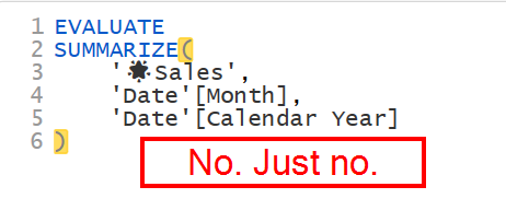
Additionally, do not carry this into the data model itself. I’ve seen people add emoji to table and field names, and that is a train wreck. It makes it harder to use intellisense when typing table/field names, and emoji may not carry their beautiful look through to the DAX editor or M editor, nor through to external tools like Analyze in Excel, DAX Studio, or Tabular Editor. Sometimes the image remains but is just black and white, or worse, you just get a generic âč icon.

The one exception to this is when I am in Power Query, I will often put an emoji in a step name to remind me to go back and fix that step later. I’d never push that nonsense to production though. 😉

So, spruce up your Power BI Apps, but just a tiny bit!

Add an Animated GIF to Your Power BI Reports

It is easy to add an animated GIF to your Power BI Reports. However, if you just add it as an image, it won’t animate. You’ll just get a static image.

Animated GIFs can be useful in reports to explain new features to users, or on hidden developer pages showing how certain things were done.

To add a GIF so it animates, do the following:

  1. Add a blank button.

  2. Make it huge.

  3. Select the Fill section for the button and turn it on.

  4. Select Add Image, and select the image from your computer.

  5. Set the Transparency level to 0%.

  6. Change Image Fit to “Fit” - this will allow you to resize the button and scale the image. Leaving it at “Normal” will require the button to be the size of the image, or it will truncate or use extra space on the page.

  7. Resize the button as desired to scale the image appropriately.

Then publish.

I have an example report here that shows this in use that shows the below animation in a report.

I use ScreenToGif to create my animations. Note: I had already posted this on Twitter, and wanted to add it to my blog so it would be more easily searchable. Since then I’ve also found out you can add animated GIF images to page backgrounds which are ideal for tool tip pages.

Be Careful When Filtering for Blanks in DAX

It is often the case in Power BI you need to filter your data to include or exclude rows where there are blanks. Be careful though, because you might get unexpected results. Consider this table:

Blanks0.png

It has 11 records, 2 of which are blank, and 3 that have $0 sales. Why would I have both blanks and 0’s in the same table? It depends on the data. Maybe blanks represent orders that are currently not finished, or were improperly filed out, whereas $0 represents orders where a customer ordered and item, but we were out of stock, so sales are $0 and we want that recorded. Let’s assume the data is correct, but we want to report on it in different ways.

Here is how you might try count the number of records that are not complete - the blanks.

COUNTROWS( FILTER( 'Sales', 'Sales'[Sales] = BLANK() ) )`

However, this may return different results than expected.

Blanks1.png

Instead, it returns 5. Why? If you want a deep dive into how Power BI handles blanks, see this excellent SQLBI article. The quick answer though is, when DAX evaluates BLANK() like this, it considers it to be zero. So it is combining the two blank and 3 zero value records, thus 5 records.

The proper way to filter for blanks in this case is to use the ISBLANK() function.

Blanks2.png

Conversely, if you want to exclude only blanks, you wouldn’t write <>BLANK() in your filter, but you’d use the NOT operator.

Blanks3.png

If you run across a model where someone has used =BLANK() or <>BLANK(), be it in a measure or calculated column, be sure those results are correct. It is possible they knew it would also include or exclude zero values, but more than likely, they were unaware of this. When I use =BLANK() in my measures knowing it will include zero values, I put a comment in the measure explaining this is the expected result, mainly so future me doesn’t see that and think past me messed up somehow. 😀

You can download a copy of the PBIX file I used here.

Quickly Format All DAX Code in Tabular Editor

If you aren’t using Tabular Editor to format all of your DAX code for you, you are missing out. I’ve written a super short script that will format all of your DAX code in measures, and make it look picture perfect in Power BI Desktop.

First, you need to download Tabular Editor. The free version is here. There is a commercial version, which I highly recommend, available here. If you don’t have Tabular Editor yet, start with the free version for now. This is the code you need:

/* Cycle over all measures in model format using DAX Formatter with Short Lines, then add 1 line feed to the start of the measure */ FormatDax(Model.AllMeasures, true); foreach (var m in Model.AllMeasures) { m.Expression = '\n' + m.Expression; }

In Tabular Editor 2.x, paste that code in the advanced scripting window as shown. Tabular Editor 3 users just click on the New Script button on the ribbon and paste the code there. For both, press the green Run button.

TabularEditor2.png

This will do 2 things.

The FormatDax() function will take all of your DAX code for measures only, and send it to DAXFormatter.com for formatting, then get the results. It does this in one big batch to lessen the load on the DAX Formatter servers, vs hitting it 100 times if you have 100 measures. The ‘true’ parameter will use the Short line format. If you like long lines, just get rid of the “, true” part. But really, who likes long lines? 😉 In both versions it will tell you how many changes were made to the model in the status bar at the bottom.

The ‘foreach’ loop will then go through all of the measures and add a line feed. An example of the result as seen in Power BI Desktop is below.

FormatDAXTabularEditor1.png

Without the line feed added, it will start the measure on the top row, and it looks like this:

FormatDAXTabularEditor2.png

It still works, it just doesn’t look as nice. The line feed forces the measure to start on the row under the measure name.

Now you need to save these changes back to Power BI Desktop, or in the case of TE/3, to a dataset via an XMLA endpoint in a premium workspace, or SSAS/AAS models depending on your license. Just click the icon that has the floppy disk on top of a cube. (It is 2021. Will we ever get rid of the floppy disk icon for save operations?)

FormatDAXTabularEditor4.png

To save this script in Tabular Editor 2, either keep a copy of the text somewhere like Evernote or OneNote, or save it to a file. Tabular Editor 3 users can save it as a macro so it is always available to you. This is one of the productivity enhancements of TE/3.

FormatDAXTabularEditor3.png

You’ll notice I said it does this for measures. It will not format DAX in Calculated Columns nor in Calculated Tables. That is currently a limitation of what parts of the model Tabular Editor is able to change.

Now you have no excuse for having poorly formatted measures.

This is just one of the many features of Tabular Editor, but it makes it worth getting even if you are new to Power BI. Formatted DAX code is so much easier to read, understand, and edit, and now it is a simple button press away.

Add a Refresh Time Stamp To Your Power BI Reports

It is often useful to tell your users when the report refreshed so they have some idea of how current, or stale, the data is. Unfortunately, you cannot just add a TODAY() formula to your report as that will change each time they open the report. This method will give you the refresh time stamp and compensate for Daylight Savings Time.

First, let’s get the time and date in Power Query. This time will only change on the report refresh, which is what you want.

  1. Open Power Query. You can do this using Get Data on the main Power BI menu, and we want a Blank Query.

  2. Click on Advanced Editor on the Home ribbon of Power Query.

  3. Remove the default text.

  4. Replace it with this code

let
    Source = Table.FromRows(Json.Document(Binary.Decompress(Binary.FromText("VZDLCQAhDAV78Sxonv9axP7bWLNPMN4mDMYhc7oUBAFRmvNOJBTy8r8RnTpNJh8TdRo0iUzT94BIIeTzRBdAaBr5GF0A0FTyMZqGdNM2mwDkG7CZZuhQKEA2ZdWI+pQ1U9ae/7v5v9vTYNzTYNiyFG/Z5rU+", BinaryEncoding.Base64), Compression.Deflate)), let _t = ((type nullable text) meta [Serialized.Text = true]) in type table [dtDSTStart = _t, dtDSTEnd = _t]),
    #"Changed Type" = Table.TransformColumnTypes(Source, {{"dtDSTStart", type date}, {"dtDSTEnd", type date}}, "en-US"),
    varCurrentDate = DateTime.Date(DateTimeZone.SwitchZone(DateTimeZone.LocalNow(),-8)),
    #"Filtered Rows" = Table.SelectRows(#"Changed Type", each [dtDSTStart] < varCurrentDate and [dtDSTEnd] > varCurrentDate),
    varDSTOffset = Table.RowCount(#"Filtered Rows"),
    #"Last Refresh Date" = #table(
        type table
            [
                #"RefreshDate"=datetimezone
            ],
        {
            {DateTimeZone.SwitchZone(DateTimeZone.LocalNow(),-8 + varDSTOffset,0)}
        }
        )
in
    #"Last Refresh Date"

Wow. What is all of that? Just to get a refresh timestamp? Yes. Let’s look at the steps.

Source: This is the Daylight Savings Time Start and End dates for the US. You will need to change this for your region as applicable. This goes through 2030 right now, and is subject to change at the whims of politicians.

You can manually edit this table by clicking on the gear icon in the Source step.

You can also get rid of all of that and point the source to a table you have somewhere. A table on your SQL server, a SharePoint List, Excel File, whatever. Swapping out the code for that is beyond the scope of this article. I wanted to provide a complete solution in one query without having to rely on external data sources. I know there are websites with this data you can link to, but I don’t like relying on websites for my reports, and don’t want to add those sites to my on-prem gateway just for a DST table.

Changed Type: This just changes the data keyed in the Source line to dates. It is always text by default. Those are in the US Date format and I told Power Query to use the en-US culture setting to do the type conversion.

varCurrentDate: This gets today’s date, with an offset for my UTC timezone, which is -8 - Pacific Time. You’d need to use Google for yours, or use this handy article on Wikipedia. You can use a decimal number here, so if you are in the Marquesas Islands, your offset is -9:30, which means you would use -9.5 here.

Filtered Rows: This will return 1 or 0 rows when the varCurrentDate variable is greater than the Start Date and less than the End Date for when DST occurs.

varDSTOffset: This is a variable that counts the rows returned in the Filtered Rows step. It is either 1 or 0. This will add 1 or 0 hrs to the time calculated next, adjusting for DST.

Last Refresh Date: This uses the formula below to get the current date and time of the refresh, adjusting for the varDSTOffset calculated above. It then puts it into a table and changes the type to “datetimezone” so it can actually be loaded into the DAX data model. Note, again, you’ll need to adjust that -8 to your UTC offset.

=DateTimeZone.SwitchZone(DateTimeZone.LocalNow(),-8 + varDSTOffset,0)

The final result is a date with a timezone offset that looks like this. Remember, I am in the -8 Pacific Timezone, and DST is in effect, so it added 1, making the net UTC Offset -7.

Note: If you do not observe DST in your area, just remove the +varDSTOffset part of the formula. You can also remove about 90% of this code, but I’ll leave that to you. Leaving the DST code in and removing varDSTOffset from your formula will not impact performance at all.

The DAX model will understand that and will adjust the time shown to the user. Finally, rename the query to “Refresh Time Stamp” and make sure it is set to load. Close Power BI and apply changes.

In DAX, create a new measure:

Last Update = 
     "Last Update on " 
     & UNICHAR(10) 
     & FORMAT(
         MAX('Refresh Time Stamp'[RefreshDate]),
         "MMM DD, YYYY H:MM AM/PM"
     )

Now drop that measure in to card. It will look something like this:

Resize and position the card as desired. If you do not like the forced line feed before the date, get rid of the UNICHAR(10) function. You can also customize the format of the time shown using the codes from this article by MIcrosoft.

Finally, to you can right-click on the Refresh Time Stamp table in Power BI and hide it. The measure will still work, but the table won’t clutter up your list of measures, tables, and fields.

One final bit of minutia. The varCurrentDate variable itself does not adjust itself for DST, so if your report runs between midnight and 3am on the day DST switches, it may be off one hour for that refresh. It will adjust though if it is run after the 3am switch.

Create A Dynamic Date Table In Power Query

Most Power BI and Power Pivot (Excel) reports require a date table so time intelligence functions can calculate correctly. I’m going to show you how to quickly set up a date table in Power Query, one that will be dynamic. The starting and ending dates will move with your data over time. And because it is in Power Query, it will be an imported table which is what Power BI loves most, being more efficient than a table created in DAX with calculated columns.

You can download the Excel sample data and Power BI file at the bottom of this article if you want to follow along step by step.

EDIT: I have a big block of M code you can use to create your own date table at this link - it is an Evernote page. The contents of this blog post though are still important is it will show you how to make that block of code dynamic.

First of all, we’ll create a static table to get the query set up, then modify it so it is dynamic. The fastest way I’ve seen to create a dates table in Power Query is to start with the one line statement shown below, which we’ll put in a Blank Query. In Power Query in Power BI, it is on the home menu, New Source, Blank Query. In Excel, it depends on the version you have.

Office 365 versions and Excel 2019:

  1. Data tab in Excel

  2. Get & Transform Data section of the ribbon

  3. Get Data dropdown menu

  4. From Other Sources

  5. Blank Query

In Excel 2016 and earlier, you will need to open the Power Query window first. This also works in Office 365 and Excel 2019 if you are already in Power Query.

  1. On the Home tab, select New Source

  2. Other Sources

  3. Blank Query

20190317 - Static Date Table.png

Now you have a blank query called Query1, with a Source in the applied steps (#1 in the above image), but nothing is there. In the formula bar, type the following (#2) and press enter:

={Number.From(#date(2018,1,1))..Number.From(#date(2019,12,31))}

Let’s break that down:

  • Lists are defined in Power Query by enclosing them in what I call squiggly brackets, but are also known as braces or curly brackets. { }

  • When used with numerical data, if you have two periods between the first and second number, it will generate a list of all numbers between those numbers. So {1..10} would generate a list of numbers from 1 to 10.

  • My first number is Number.From(#date(2018,1,1)). This returns 43101. That is the same thing You’d get in Excel if you typed 1/1/2018 in a cell, then formatted it as a number.

  • My second number is 43830, the numerical value of December 31, 2019.

  • The total list has 730 numbers, 43101 - 43830, which is two years of data. Perfect. No skipped dates.

Now we need this to be a table of dates, not a list of numbers. Let’s fix that.

  1. Click the “To Table” icon (#4) in the tool bar. In the To Table dialog box, leave the defaults of “None” for the delimiter and “Show as errors” for extra columns. There are no delimiters or extra columns here, so there won’t be any issues.

  2. For the data type where it says ABC/123, click that and change it to Date. This is the tiny box below with the arrow pointing to it in the image below.

  3. Rename the column to Date.

  4. Rename the query to Date.

  5. Right Click on the query and make sure Enable Load is checked.

20190317 - Date Column.png

At this point, it is a valid date table, but quite spartan, and it isn’t dynamic. First let’s make it dynamic so the date ranges move with your data. I’ve created some sample data that I’ll use for this. I want my date table to encompass the earliest data from my Sales table so all of my sales history is covered, and I want the latest dates in the table to handle dates in the Open Purchase Orders table, which has expected receipts of merchandise well into the future.

A couple of rules about Date tables first:

  • The dates must be contiguous. There can be no gaps. Even if your business doesn’t operate on the weekends or holidays, those dates cannot be missing from your table. The way the data was created using a List ensures no dates are skipped.

  • You should almost always include the full year for any date in your table. So if your data has Jan 1, 2019 in it, you should have all 365 days of 2019 in your date table. I am working with calendar years in this example. If you have a fiscal year, that is fine, but your data should still encompass a full fiscal year. So if your year is July 1 through June 30, if you have July 1, 2019 in your dates table, you should have all dates through June 30, 2020, a full fiscal year.

So how do we make this dynamic? We need to figure out what the earliest date is in the sales table, since that table is going to have the oldest data for sales history, and we need to know the latest date will be based on the last date in the OpenPOs table.

20190317 - Earliest Date.png
  1. Right-click on the Sales table make sure “Enable Load” is not checked. You’ll see why in a minute.

  2. Right-click again on the Sales table and select “Reference”. We now have a second query that is identical to the Sales table, because it is simply pointing to the Sales table. Any changes to the Sales table will affect this new query, which is probably called Sales (2) at this point.

  3. Rename Sales (2) to pmEarliestDate. I recommend you put no spaces in the name as that complicates things later on.

  4. Right-Click and ensure “Enable Load” is not checked. Not only is there no need to load this, it will create an error as lists cannot be loaded into Power BI or Power Pivot.

  5. Select the Date column (#1 in the above image)

  6. On the Transform tab, select Date (#2), then Earliest (#3).

Now we have the earliest date as a list. A single item list. In my sample data, it is Jan 2, 2015. Jan 1 was a holiday, so I didn’t expect any data there, but remember, I need to make this a full year, so let’s tweak the formula that was generated by Power Query.

  1. Power Query used the List.Min() function to the earliest date. List.Min(Source[Date])

  2. We need to extract the year first, so wrap that in Date.Year(). Now it is just 2015.

  3. Now convert it back to a date, starting with January 2. Wrap step 2 with #date(year,1,1). The final formula is:

= #date(Date.Year(List.Min(Source[Date])),1,1)

If you were on a fiscal year, you’d need to do a bit more math to get this to July 1, 2014, for example, but still pretty easy to do. You’ve probably figured out by now that #date() is the same things as DATE() in Excel, taking year, month, and day for the arguments.

Now, we need the last date. I’ll repeat the steps above on my OpenPOs table’s date column, but instead of the Earliest date, I want the Latest date. My final formula is:

= #date(Date.Year(List.Max(Source[Expected Receipt Date])),12,31)

This will give me a date of Dec 31, 2020 since the latest date in that table is Mar 31, 2020. Note this time Power Query used the List.Max function to get the latest date in the table. Call this query pmLatestDate

Now I know my first and last date, and both are calculated dynamically. If dates in my source tables change, so to these two parameters.

So how do we make the Date table we created use these dates? Remember our original Date table started with this Source line:

={Number.From(#date(2018,1,1))..Number.From(#date(2019,12,31))}

We need to edit that formula a bit. We just get rid of the hard coded dates, and replace with our dynamically calculated dates. It becomes this:

={Number.From(pmEarliestDate)..Number.From(pmLatestDate)}

Now we have a date table with 2,192 consecutive dates from Jan 1, 2015 to Dec 31, 2020, with leap years accounted for automatically for us.

So why did I create a reference from both the Sales and OpenPOs table, and ensure those original table are not loaded? Now I can tweak my date ranges in those original tables, and the dynamic dates will account for it. So if my actual sales table has history going back to 1995, I can filter that in the original sales table to be 2015 and later if I want, and my actual data and Date table will reflect that.

Same thing with my OpenPOs table. I’ve seen companies put fake data, say Dec 31, 2999, for things like blanket POs, or some future forecast, or whatever. I don’t want a date table or actual data going out that far, so I limit it to realistic date ranges in the OpenPOs table with a filter on the Date column.

To load relevant data, I need to create two more references:

  1. Create a reference from Sales, and call it Sales Data.

  2. Create a reference from OpenPOs, and call it Open Purchase Orders.

  3. Makes sure “Enable Load” is checked for both of these.

  4. At this point, in both tables, you can do any further transformations, such as removing columns, grouping data, or whatever you want. Because these transformations are on references to original Sales and OpenPOs table, the original tables are unaffected, and the Date table will be unaffected, which is what you want.

It can help to see how the queries are related to each other. Click on the View tab in Power Query, then Query Dependencies. You should see something similar to this:

20190317 - Query Dependencies.png

You can see how the calculation of the earliest date, pmEarliestDate, and the Sales Data query both come from the original Sales query, but changes in the Sale Data query will not affect the date calculation. You can also see which queries are loaded into Power BI from here, and which have the load disabled.

Finally, I need to enhance the Date table. Right now, it is just dates. But to have rich reporting capabilities, we need things like month names and numbers, quarters, years, etc. I’ll create a few as a place to get started:

  1. Select the Date column in the Date table, then on the Add Columns tab, select Date, Month, Month. This gives us the month number.

  2. Select the Date column, Add Columns, Date, Year, Year.

  3. Select the Date column, Add Columns, Date, Month, Name of Month

You get the idea. Now let’s add a few things that you cannot do through the tool bar. We are going to add a column that will give us the Month and Year in the format of MMM-YY, so Jan-15, Feb-15, Mar-15, etc. This is handy for a number of visuals.

  1. Add Column

  2. Custom Column

  3. Name the column MMM-YY

  4. Type in the following formula:

=Text.Start([Month Name],3) & "-" & Text.End(Text.From([Year]),2)

Make sure to set the type to Text so it isn’t the Any data type (the ABC/123 type)

Now, if you know anything about creating charts or tables in Power BI and Excel, that column will sort alphabetically, which is useless, unless you want April to be before January. Of course you don’t. So we need to create a sorting column for this. Add a new column, call it “MMM-YY Sort” and add this formula:

=[Year]*100 + [Month]

This will create a column that will have 201501, 201502, 201503, etc to correspond to Jan-15, Feb-15, Mar-15, etc. You can use this column to sort your MMM-YY sort. Lastly, change this column to a Whole Number format.

At this point you can add dozens of more columns depending on your date needs. Quarters, weeks, ISO 8601 formatted dates, etc. But in our simple example, this is a really short query, and is fully dynamic. In the Advanced Editor, it would look something like this:

let
    Source = {Number.From(pmEarliestDate)..Number.From(pmLatestDate)},
    #"Converted to Table" = Table.FromList(Source, Splitter.SplitByNothing(), null, null, ExtraValues.Error),
    #"Changed Type" = Table.TransformColumnTypes(#"Converted to Table",{{"Column1", type date}}),
    #"Renamed Columns" = Table.RenameColumns(#"Changed Type",{{"Column1", "Date"}}),
    #"Inserted Month" = Table.AddColumn(#"Renamed Columns", "Month", each Date.Month([Date]), Int64.Type),
    #"Inserted Year" = Table.AddColumn(#"Inserted Month", "Year", each Date.Year([Date]), Int64.Type),
    #"Inserted Month Name" = Table.AddColumn(#"Inserted Year", "Month Name", each Date.MonthName([Date]), type text),
    #"Added MMM-YY" = Table.AddColumn(#"Inserted Month Name", "MMM-YY", each Text.Start([Month Name],3) & "-" & Text.End(Text.From([Year]),2)),
    #"Added MMM-YY Sort" = Table.AddColumn(#"Added MMM-YY", "MMM-YY Sort", each [Year]*100 + [Month]),
    #"Changed Type1" = Table.TransformColumnTypes(#"Added MMM-YY Sort",{{"MMM-YY Sort", Int64.Type}, {"MMM-YY", type text}})
in
    #"Changed Type1"

The final step is once this is loaded, close Power Query and set this as your date table for Power BI:

  1. Make sure automatic date logic is off in Power BI. Select File, Options and Settings, Options, Data Load. Uncheck “Auto Date/Time”. Leaving this checked will create all sorts of unnecessary hidden tables and columns. You’ve created a perfect Date table. Don’t let Power BI’s AI mess this up.

  2. In the Visual view, right-click on the Date table, and select Mark as Date Table, then select the Date column.

  3. It will validate it by ensuring you have no skipped or duplicate dates. Press Ok.

Now you can start creating your visuals, measures, etc. in Power BI, or pivot tables in Excel. As data is updated from your source system, your Date table will dynamically expand. This is handy as you would never have to edit the date range in the table and republish the report. The Power BI service will refresh all of the data, including calculating the ever-expanding date range as sales and purchase orders continue to happen into the future.

Below are the two files I used in my example, the PBIX file and the Excel XLSX file with the sample source data.

Power BI Dynamic Date Table

Excel Sample Source Data

Calculate Last Twelve Months Using DAX

One of the more common calculations a company uses is the last twelve months, or LTM, of data. This can be tricky if your date table always has a full year of dates for the current year, which it generally should. So if today is March 3, 2019, my date table will have dates through December 31, 2019. This is usually necessary for the date intelligence functions in DAX to work properly, and companies may have data beyond today in their model. For example, budget and forecast data will generally extend through the end of the year, or at least beyond today.

However, it often is challenging when you are trying to hide these future dates for specific measures. I’ve seen solutions that use functions like LASTNONBLANK() that get the last date with sales data in it, and that can work, but depending on how your data is laid out, it can make for larger and more complex measures with multiple FILTER() functions. For a visual you can sometimes use the relative filtering feature, but that won’t change the underlying value of the measure if you reuse it in another visual or refer to it from another measure.

Marco Russo recently wrote an excellent post on hiding future dates or calculations in DAX. The concept is brilliantly simple. Just add a column to your date table that returns TRUE if the date is today or earlier, or FALSE if it is after today, then use the CALCULATETABLE() function to return just a table of dates that fall in that TRUE range of dates.

That wouldn’t work for me though exactly as it was presented. I needed to create dates that were in the previous 12 calendar months, and I was working with a Power BI Dataset, which is a Live Query, and you cannot add columns to Live Query models.

20190303 - No New Column SSAS.png


So I opted to create two measures. First, I needed to create the date logic in my dates table. I wanted the previous 12 full calendar months, not the last 365 days of data. Note that my date table is named ‘Calendar’.

LTM Dates = 
VAR EndDate =
    EOMONTH ( TODAY (), -1 )
VAR StartDate =
    EDATE ( EOMONTH ( TODAY (), -1 ), -12 ) + 1
RETURN
    IF (
        MAX ( 'Calendar'[Date] ) >= StartDate
            && MAX ( 'Calendar'[Date] ) <= EndDate,
        TRUE (),
        FALSE ()
    )

This measure has two variables:

  1. EndDate - This calculates the last day of the month for the previous month based on TODAY().

  2. StartDate - This calculates the month 12 months prior to the EndDate, then adds one day to move to the first day of the next month.

Finally the measure uses a basic IF() statement, with some AND logic. If today is March 3, 2019, it will return TRUE for the dates March 1, 2018 through February 28, 2019. For dates before March 1, 2018, and after February 28, 2019, it returns FALSE. It will do the for the entire month of March. On April 1, the LTM range becomes April 2018 - March 2019.

I could have used the AND() function instead of the double ampersand, but I use the double ampersand as I can use multiple conditions, like condition1 && condition2 && condition3, whereas AND() is limited to two conditions. By getting in the habit of using &&, I never have to remove an AND() function and redo the syntax. Side note: Use double pipes to allow multiple conditions for OR logic. Condition1 || condition2 || condition3, as OR() is also restricted to two conditions.

Now I needed to calculate sales for LTM. I already had the [Total Sales] measure below:

Total Sales = 
CALCULATE(
    SUM(Sales[Sales]),
    Sales[Type]="ACT"
) 

The measure for [Sales LTM] then is:

Sales LTM = 
CALCULATE(
    [Total Sales],
    CALCULATETABLE(
        'Calendar',
        FILTER(
            'Calendar',
            [LTM Dates] = TRUE()
        )
    )
)

You could combine my first measure with the second measure, replacing [LTM Dates] with the full measure, after tweaking the date logic in the FILTER() section a bit in this [Sales LTM2] measure.

Sales LTM2 =
VAR EndDate =
    EOMONTH ( TODAY (), -1 )
VAR StartDate =
    EDATE ( EOMONTH ( TODAY (), -1 ), -12 ) + 1
RETURN
    CALCULATE (
        [Total Sales],
        CALCULATETABLE (
            'Calendar',
            FILTER (
                'Calendar',
                'Calendar'[Date] >= StartDate
                    && 'Calendar'[Date] <= EndDate
            )
        )
    )

However, this measure is both a bit more complex, and if you wanted to have other LTM measures, such as units sold, or cost of goods over the last year, dollars purchased, etc., you’d have to repeat the date logic in each measure. If you wanted to change the LTM logic, say switch from previous 12 completed calendar months to last 365 days, or last 12 calendar months but starting with this month, you’d have to edit every measure calculating the date range. By breaking it into two parts as I’ve done above, I can edit just the [LTM Dates] measure and all other measures that use it will automatically recalculate accordingly.

Also note that unlike Marco’s solution, my date measure will not behave as a calculated column.

  1. You could not use it in an iterator function such as SUMX(), AVERAGEX(), and so on, as iterators use row context, and measures generally do not have row context. Well, iterator measures do, but they have to have row context to start with. They cannot create it out of thin air.

  2. You also cannot use measures in slicers or filters in your report. For those, you must use either a calculated column, or bring the column in through Power Query.

  3. You cannot use it as the date column in a date intelligence function, because it isn’t a column.

Calculated columns, and better yet imported columns via Power Query, can be a better choice for the above secenario, but that is not always an option if your source data is from SSAS or a Power BI Dataset where adding columns isn’t permitted.


Quickly Pad Columns in Power Query with Text

When working with data in Power Query, you often will need to pad either the beginning or ending of a column with specific text, especially if the final result will be data you export to a CSV file for uploading into a different system. Common examples include:

  • Some sort of “number” that needs to be padded with leading zero’s.

  • Labels that need to be padded with trailing spaces to ensure the cell contents are a specific length.

This can even be useful in Power BI if a report is designed to be exported by the end user to upload or otherwise use for input into a different system.

In Excel, you can do this in a worksheet cell with a formula. This will create a string 15 characters wide with trailing periods, assuming the text you want to convert to a 15 character string is in cell A1.

=LEFT(A1&REPT(".",15),15)

You can do the same in Power Query with the following formula, but this is not the easiest way.

Text.Start([Labels] & Text.Repeat(".", 15), 15)

The Text.Start() function is equivalent to Left() in Excel, and Text.Repeat() corresponds to REPT().

But there is a faster way to do this and the Power Query function name tells you exactly what it is doing.

=Text.PadEnd([Labels],15,".")

Text.PadEnd() will cause the text value, [Labels] in this example, to be padded until it is 15 characters long. I used a period so you could see the results, though you’ll most often use a space. You can see the results are the same for Excel and Power Query.

20190224 - TextPad Start.png

I changed the font in the Power Query window to monospace so you could see the text is the same length with both methods. You can change to monospace on the View tab of Power Query.

Text.PadEnd() has 3 arguments:

  1. The text you are manipulating. This can be a single filed, or a formula that generates text.

  2. The length you want your field to be. Note that if the text is longer than the padded length, Text.PadEnd() will not truncate your data to your desired length. It will return the full length of your text, but with no padding as the string is already longer than the length you set.

  3. The text to pad with, which is optional. If you leave this off, it will use spaces, ASCII code 32. If you use two or more characters, it will result in an error. It must be a single character.

You can use Text.PadStart() to pad at the beginning. It works exactly the same way as its sister function Text.PadEnd().

=Text.PadStart([Labels],15,"0")

As you can see, you only need to change from Text.PadEnd() to Text.PadStart(). Using the Excel method, you not only have to switch from the LEFT() to RIGHT() function, but change the order of the concatenation of the text in the formula, making sure not to mess up the Text.Repeat() function. The Excel method would be:

=Text.End(Text.Repeat("0", 15) & [Labels], 15)
20190224 - TextPad Start.png

In this way, Power Query is very much like Excel in that there is usually more than one way to do the same thing. I think using the Text.Pad* functions makes your code more readable, and easier to edit without having to nest multiple functions.